#Petra Goldberg
Explore tagged Tumblr posts
Text

From "There's No Place Like Home" in X-Men Annual #9, 1985. Chris Claremont script, Arthur Adams pencils, Al Gordon, Mike Mignola, and Arthur Adams inks, Petra Goldberg colors, Tom Orzechowski letters.
#there's no place like home#x men annual#x men annual 9#xmen#x men#chris claremont#arthur adams#al gordon#mike mignola#petra goldberg#tom orzechowski#new mutants#phoenix#cyclops#colossus#wolverine#ororo#shadowcat#magik#comic#comics#comic book#comic books#comic panel#comic panels#marvel#marvel comics#dragon
19 notes
·
View notes
Text

Devil Dinosaur by Jack Kirby and Mike Royer (1978) Source (Jeremy Kirby’s x)
Colors by Petra Goldberg

7 notes
·
View notes
Text


Conan the Barbarian #46 -January 1975-
Marvel comics
"The Curse of the Conjurer!"
script: Roy Thomas
artists: John Buscema & Joe Sinnott
colors: Petra Goldberg
letters: John Costanza
#conan the barbarian#marvel comics#roy thomas#john buscema#joe sinnott#petra goldberg#john costanza#comics
10 notes
·
View notes
Text

The Avengers #147
by Steve Englehart; George Perez; Vinnie Colletta: Petra Goldberg,..
Marvel
#marvel comics#the avengers#george perez#Vince Colletta#Petra Goldberg#Gaspar Saladino (page 1#uncredited)#Denise Wohl#Steve Englehart
23 notes
·
View notes
Text
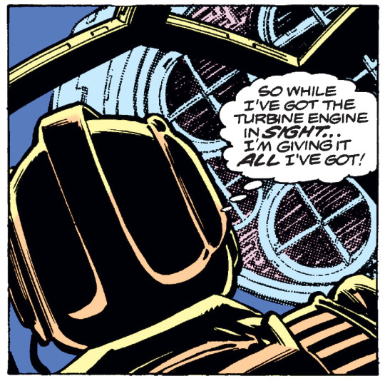
August 1979. Modern reprints of old comics are digitally recolored and usually printed on much heavier, whiter paper stock than the cheap newsprint that was the norm through the mid-1980s. While modern print production usually gives much sharper reproduction than was possible 40 or more years ago, when it comes to color, the results aren't always an improvement. Some modern editions take significant liberties with original palette, adding tones and highlights and/or digital effects that were neither envisioned nor possible when the original version was published. (Dark Horse's EC ARCHIVES are absolutely ruinous in this regard, an insult to the memory of original colorist Marie Severin.) Even when the reconstruction follows the original palette closely, it often fails to take into account the way different paper stocks absorb ink, which frequently makes the color art look gaudy in a way it originally didn't.
Here's a comparative example from issue #26 of the original Marvel STAR WARS series. This sequence is noteworthy because original colorist Petra Goldberg did an outstanding job in establishing the mood of an unusual and evocative scene. Luke Skywalker, piloting a captured TIE Fighter, has just destroyed a House of Tagge facility located deep within the atmosphere of Yavin, a gas giant. Although he was able to follow a Tagge beacon on his way in, he's just destroyed that beacon, and the storms and strong magnetic field of Yavin make both visual navigation and instruments useless, as Luke had been warned prior to the mission. The original page:

Next, here's the digitally recolored version:
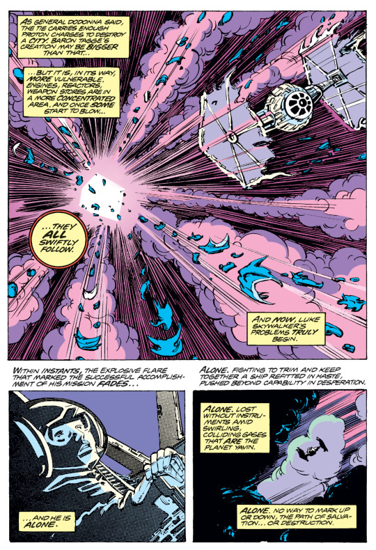
First, note that the reconstruction has eliminated the orange and yellow that Goldberg used to indicate the explosion. In the original version, the center of the explosion is yellow, surrounded by an area of orange that branches out into the lines of force indicating the shockwave. The digital version has replaced the yellow with white and the orange with pink, making the explosion less distinct from the surrounding clouds; in the original, the orange and yellow make clear that the clouds are being lit by the explosion, which isn't the case in the digital version. In the second panel, the digital version makes Bob Wiacek's Zipatone texture fills much more apparent (maybe more than they need to be) and has eliminated what appear to be unintended splotches of purple on Luke, but the pale yellow of the original shading on his face and helmet has been changed to white. The third panel sticks to the original palette, but is a couple of shades brighter, and the highlights on the purple cloud behind the ship look less sickly, losing the sense that the light is fading.
Here's the following page:

And the digitally recolored version:
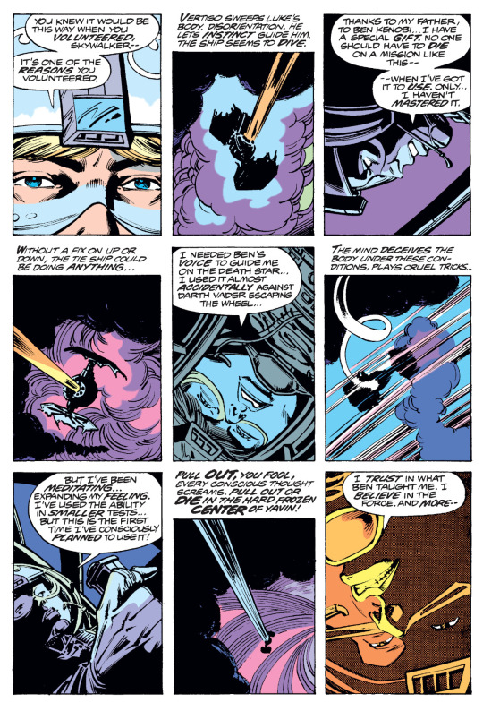
There are fewer coloring liberties this time (although notice that the shading on the center ridge of Luke's helmet in the first panel has gone), but the final panel reveals a Zipatone fill on Luke's face that's not at all evident in the original panel — whether it's just not visible in the printed comic or was added in the reconstruction, I couldn't say without seeing the original pages. The principal dilemma here is that that the colors appear both brighter and crisper, which is not at all what Goldberg was going for originally. The point of this scene is that Luke is lost in the clouds, flying blind, so on newsprint, even the lighter blues and pinks are more muted and variegated. By in effect turning up the brightness and contrast, the original sense of claustrophobia is dampened, which isn't an improvement.
This kind of recoloring is always going to be a compromise, and some of the challenges it presents don't have straightforward answers. (For instance, should you fix obvious coloring errors in the original? Should that extend to altering colors to match how characters appeared in later stories?) However, ill-considered or sloppy digital coloring can do significant aesthetic harm.
14 notes
·
View notes
Text

Marvel Fanfare #26 (May 1986) cover by Pat Broderick and Petra Goldberg.
3 notes
·
View notes
Photo
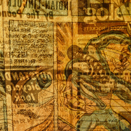
AMAZING ADVENTURES v.1 #27 1974, Marvel Comics Don McGregor writer, Craig Russell art, Jack Abel inks, Petra Goldberg colors, John Costanza letters
#amazing adventures#comics#marvel]1974#don mcgregor#craig russell#jack abel#petra goldberg#john costanza#pagethrough#intrapanel
7 notes
·
View notes
Photo
"I've given you the means to sacrifice our humanity to the cause of profit! And if you use it - you're a fool!" - Ted Sallis
Adventure into Fear #16 ‘Cry of the Native!’ (1973) by Steve Gerber, Val Mayerik, Sal Trapani and Petra Goldberg. Edited by Roy Thomas. Cover by Frank Brunner.
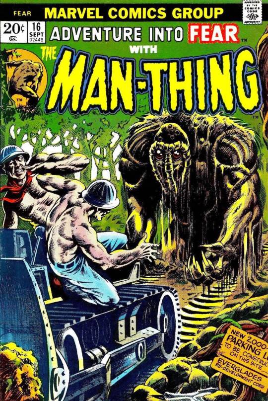
(1975)
#adventure into fear#man-thing#ted sallis#marvel#steve gerber#val mayerik#sal trapani#petra goldberg#roy thomas#frank brunner#comics
118 notes
·
View notes
Text

From "There's No Place Like Home" in X-Men Annual #9, 1985. Chris Claremont script, Arthur Adams pencils, Al Gordon, Mike Mignola, and Arthur Adams inks, Petra Goldberg colors, Tom Orzechowski letters. Photoshop color reduction.
#there's no place like home#x men annual 9#x men#xmen#ororo munroe#asgard#chris claremont#arthur adama#al gordon#mike mignola#petra goldberg#tom orzechowski#bronze age comics#marvel#marvel comics#comic#comics#comic book#comic books#rage#tears#tears of rage#mohawk#circlet#teeth and gums colors are reversed
5 notes
·
View notes
Text

Jim Starlin, Frank Giacoia, and David Hunt Marvel Premiere #8 Splash Page 15 Original Art (Marvel, 1973) Source
Colors by Petra Goldberg

4 notes
·
View notes
Text
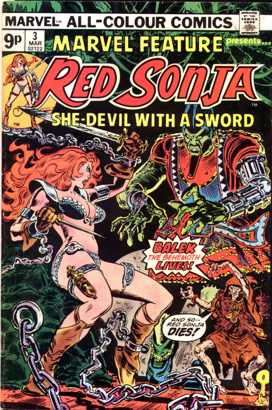
Red Sonja She-devil with a Sword #3 -March 1976-
written by Bruce Jones
art by Frank Thorne
colors by Petra Goldberg
editor: Roy Thomas
#marvel comics#red sonja she devil with a sword#red sonja#bruce jones#frank thorne#petra goldberg#comic cover
27 notes
·
View notes
Text
Doctor Strange #29 ‘He Who Stalks!’ (1978) by Roger Stern, Tom Sutton, Ernie Chan and Petra Goldberg. Edited by Archie Goodwin. Cover by Frank Brunner.

Cover of the Day: Doctor Strange #29 (June, 1978) Art by Frank Brunner
#doctor strange#stephen strange#nighthawk#marvel#roger stern#tom sutton#ernie chan#petra goldberg#archie goodwin#frank brunner#bronze age comics#comics
35 notes
·
View notes
Text
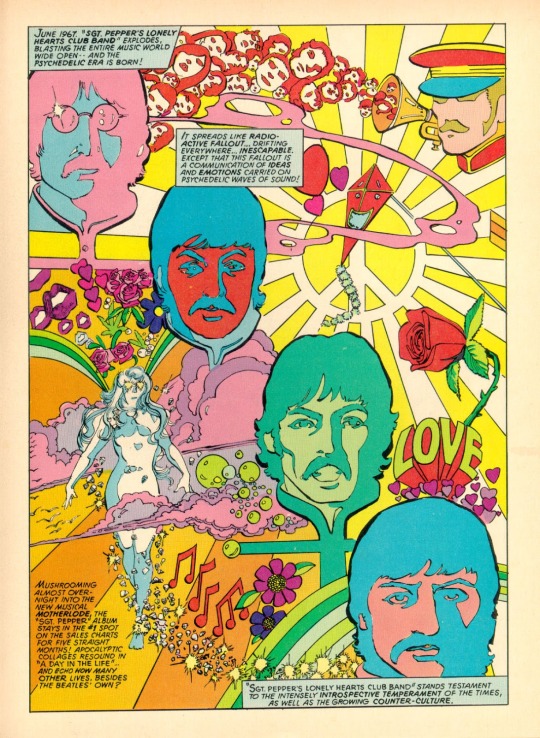
Marvel Comics Super Special #4: The Story of the Beatles
by David Anthony Kraft; George Perez; Klaus Janson; Petra Goldberg and Tom Orzechowski
Marvel
#Marvel Comics Super Special#david anthony kraft#George Pérez#Klaus Janson#Petra Goldberg#Tom Orzechowski#marvel comics#comic book
16 notes
·
View notes
Text


PK: You employ me, Anna. What would no have done to that?
#hbo industry#industry hbo#industry#tvedit#tvfilm#hboedit#*#3x02#petra koenig#sarah goldberg#anna gearing#elena saurel
99 notes
·
View notes
Text


Did you know that when Dolly Parton said, "We cannot direct the wind, but we can adjust the boat sails," she wasn't talking about some guy. She was talking about her investment portfolio.
SARAH GOLDBERG as PETRA KOENIG Industry (2020–) Season 3
76 notes
·
View notes
Text
Daredevil #117 ‘Mind Tap!’ (1974) by Chris Claremont, Steve Gerber, Bob Brown, Vince Colletta and Petra Goldberg. Edited by Roy Thomas. Cover by Gil Kane and John Romita.

#daredevil#matt murdock#black widow#natasha romanoff#marvel#chris claremont#steve gerber#bob brown#vince colletta#petra goldberg#roy thomas#gil kane#john romita#john romita senior#comics
40 notes
·
View notes